Now that you have built some cards and changed photos, descriptions and titles using nested symbols, we’d like for you to see how else you can implement them in your designs!
Upload your final Sketch files to the Google Drive in the “Completed Work” folder.
Design a Bottom Tab Bar
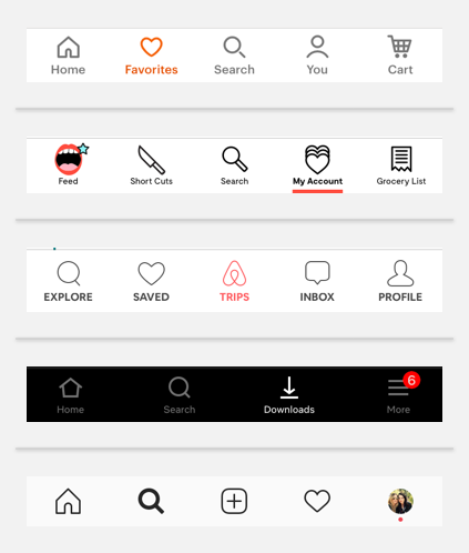
For this exercise, you will create a bottom tab bar for a mobile app similar to one of these:

Steps
- Watch Nested Symbols overrides Duration: 1:51
- Watch Better Icons with Sketch Layer Styles Duration: 6:54
- Read Layer Styles and Text Styles by Drew Vosburg.
- Create your own bottom tab bar using nested symbols, masks, layer styles and overrides.
- Get creative! Use colors and icons of your choice.
Requirements
- 5 tabs with icons and text
- Use of nested symbols and layer styles so that various icons and colors can be swapped in and out
- Show what the pressed state looks like for each of the 5 tabs
Nice to Have
- Indication of a notification within a particular tab (i.e. new messages, items in cart, etc.)
Resources
- Video Tutorial about how to create nested symbols with a Wunderlist App demonstration.
- Organizing Layer Styles Video about how to create and manage layer styles
- Better Icons with Sketch Layer Styles Jesse Showalter explains the Layer styles feature in the context of icons.
- Layer Styles and Text Styles More in detail article about layer styles and text styles with images and clear explanations of pros and cons.